B-bis designs refurbishment orangery and collection pavilion Middelheim Museum
(23.04.2024) Over the past year and a half, Antwerp's Middelheim Museum underwent an extensive renovation. On Tuesday 23 April, the open-air museum's new visitor experience was presented accordingly. B-bis took care of the refurbishment of the orangery and the collection pavilion and presented its design to the public, highlighting its combined experience in both museum operation and interior design.
As a starting point, we took the present qualities of the existing pavilions. With a number of clear interventions, we improved the identity and public-friendliness of the open-air museum. New graphic elements create a connection between the two pavilions and the various places in the park. Additional functions were installed in the pavilions as well, allowing more efficient use of the existing spaces while creating a fresh dialogue between the new and what already exists.
Orangery
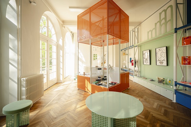
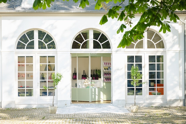
The orangery is the brand new visitor pavilion of the Middelheim Museum. Here, guests can find information about the exhibitions and routes, discover out more about the museum or get a souvenir from the museum shop.
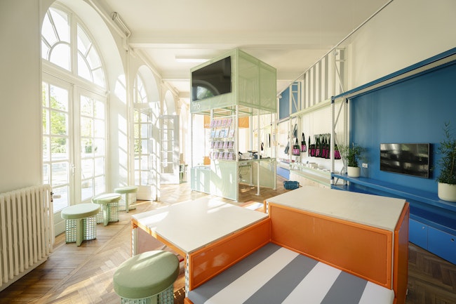
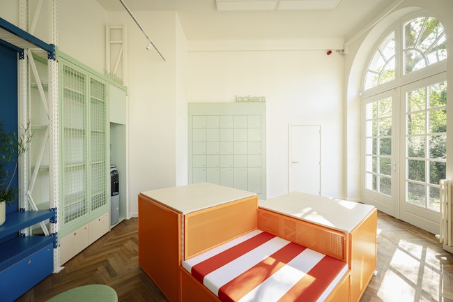
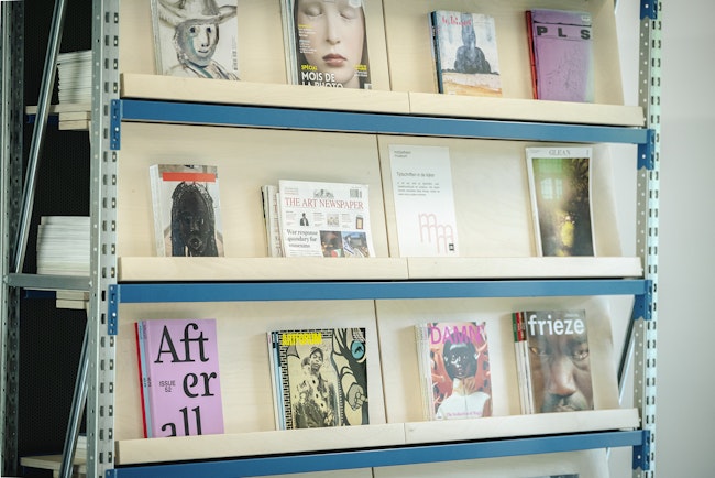
We added three furniture islands and a graphic back wall, which serves as a billboard to convey all the functions of the visitor pavilion. With their 45-degree rotation, the positions of the information, seating and sales islands face both the direct access from the square that serves in summer and the left draft axis used in winter. The direct access doors open and close regularly during the summer period, turning the orangery into a kind of covered outdoor space. In this way, our design contributes to the indoor-outdoor experience that recurs throughout the open-air museum. Finally, a personalised shelving system - which also returns in the collection pavilion - was used as a frame for the orangery.
The entire interior serves as an invitation to further explore the building. In addition to the orientation aspect, it has a very practical function: helping visitors navigate the open-air museum through various informative presentations.
Collection pavilion
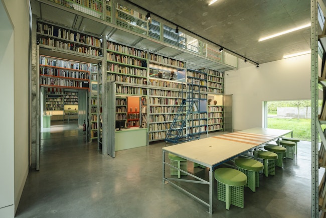
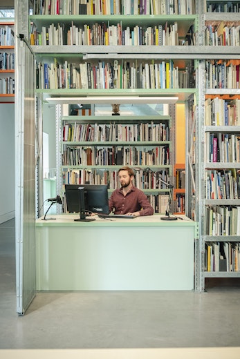
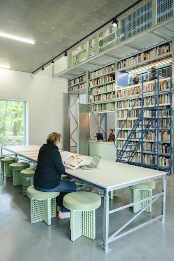
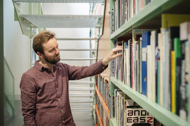
The collection pavilion was redesigned, bringing together even more of the collections that support the core collection in the park. In addition to the depot, it now includes a new museum library as well.
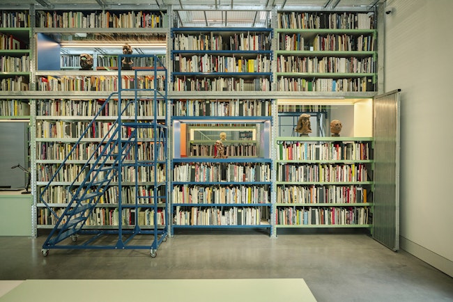
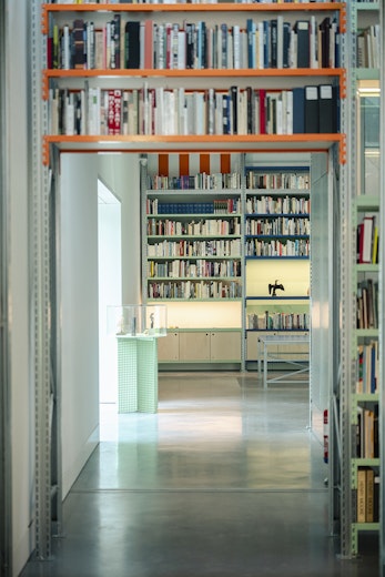
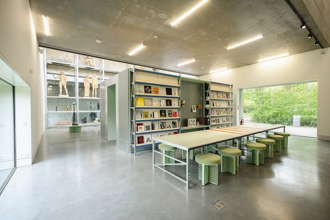
Here, too, the existing interior served as our starting point: the industrial shelving system at the entrance looks light and transparent and fully conveys the depot function of the pavilion. We therefore chose to retain this element.
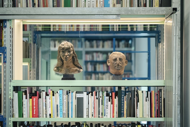
The collection pavilion houses a diverse programme. The addition of the museum library could not interfere with the depot concept - and vice versa. We looked for ways to let both functions go hand in hand. We carried out the main intervention in the central double-height space: we added a new, semi-industrial shelving system as a reference to the existing shelves. This clear intervention makes optimal use of the height of the pavilion, matches the atmosphere of the collection pavilion as a depot and houses a large part of the library. The transparency and fordability of the structure allow visitors to discover both art and (art) literature.
More on the entire updated visitor experience at the Middelheim Museum here.
Press
VRT NWS - De Tijd - De Standaard - Het Nieuwsblad - Gazet Van Antwerpen - PZC

