scenography MAS
Theatre & exhibitions
Five thematic expositions will show a selection of the city of Antwerp collection of about 410.000 pieces of art. Each exposition will provide the visitor with the new baseline of the MAS: “Antwerp in the world & The world in Antwerp”.
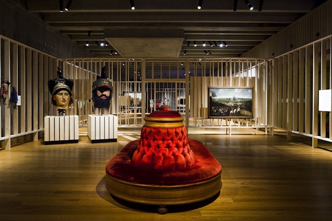
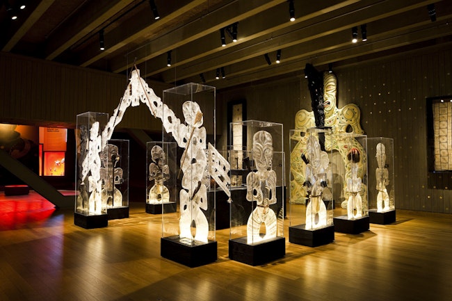
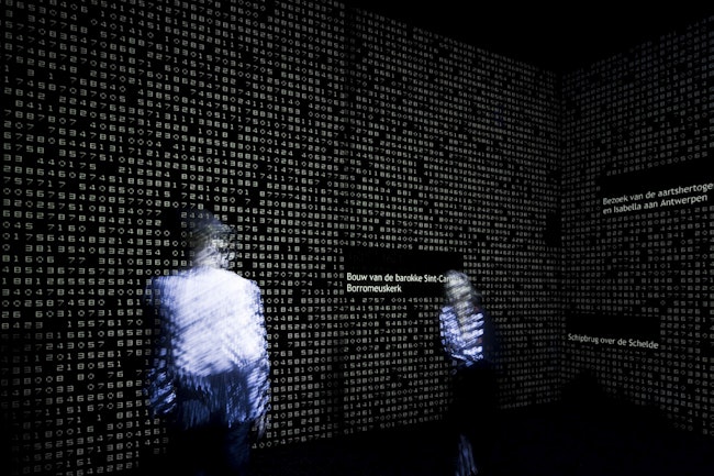
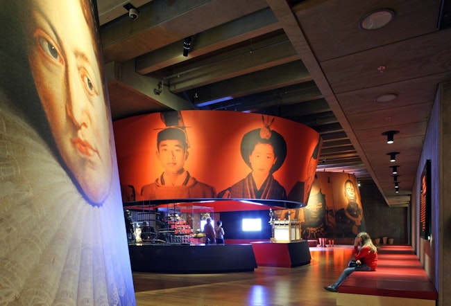
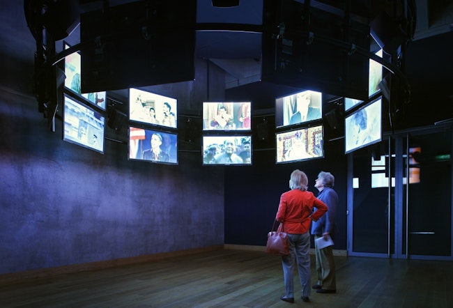
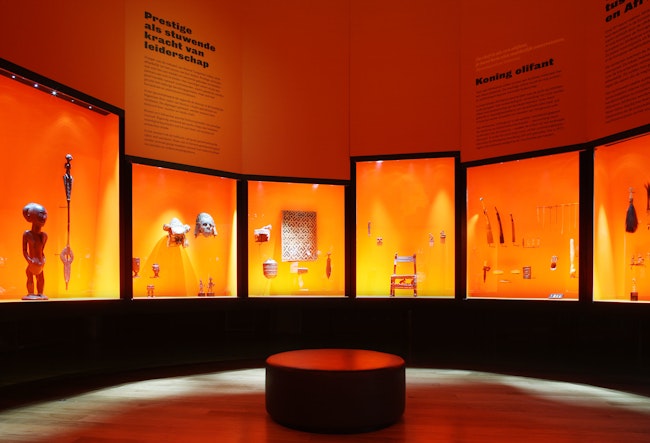
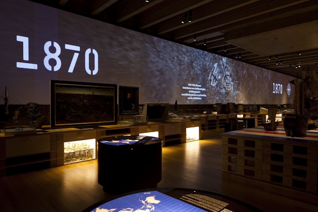
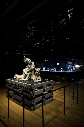
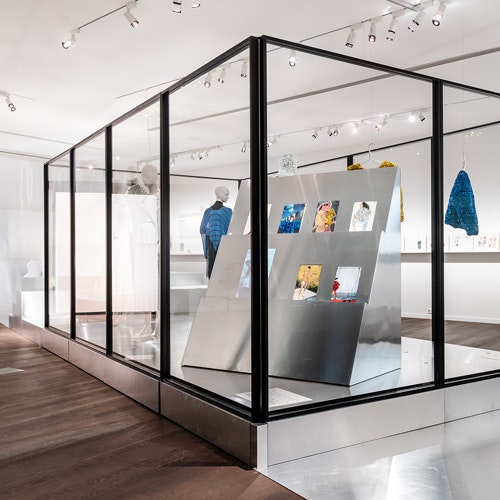
Present day exhibitions should be conceived as “experience exhibitions”. Such an expo can be compared to a theatrical performance on stage. Visitors are not merely confronted with the content, but also have a visual, auditory and tactile experience. So during a visit at a museum the visitor’s different senses must be stimulated.
The visit should be an experience rather than an exchange of knowledge or information. The average visitor expects to be entertained for 1 to 1,5 hours tops. There are 3 kinds of visitors. The one seeking an extra value on a subject that he already knows well, the recreational visitor who is looking for quality time but also for entertainment and finally the groups (10 to 25 people : clubs, pensioners, schools, …) who expect guided tours. All these visitors dwell around at different speeds and with different focuses in the same rooms. The one seeking extra value takes his time and inspects each object scrutinously, the recreational one wanders around and stops only at what is of interest to him. The guides decide on which spot they pause to give indepth information.
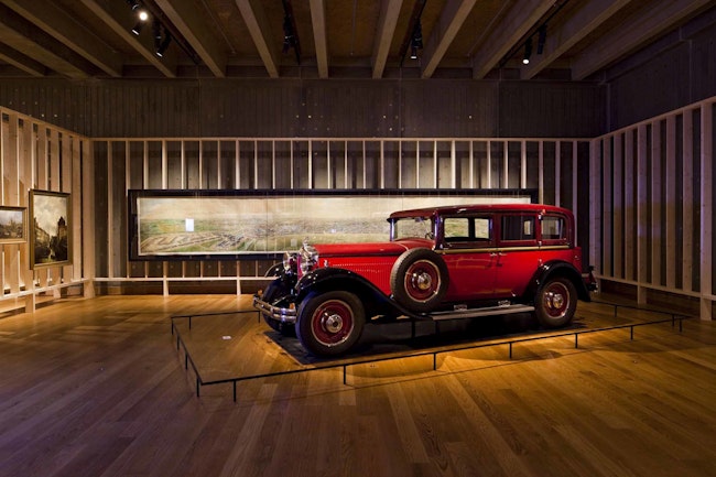
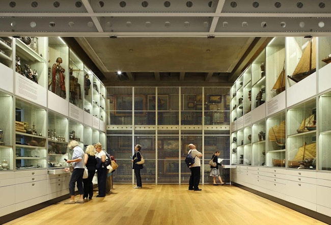
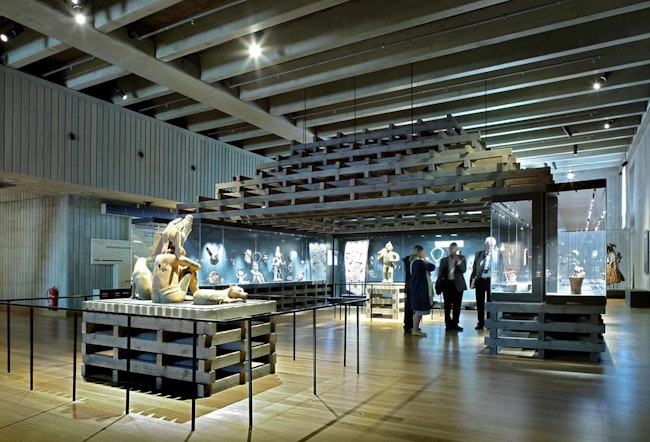
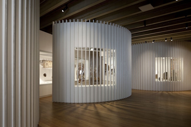
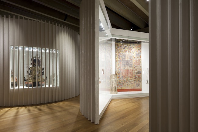
The building and the spatial layout of the exposition floors, designed by NRA, help create the image of the museum: yellow wooden floors, concrete walls decorated with brass rings, large horizontal wooden technical coves and metal trusses that carry the overhanging parts of the museum. The specific architecture of the building offers 7 clearly distinguishable areas per exposition box. There were a lot of technical restrictions in the museum halls, but we used the restrictions as starting points for the design of the expositions. On each floor 7 different exposition rooms give 7 completely different views on the subject.
In the first corridor: WAKE-UP area
After the corridor: INTRO area
Next to the escalators: FOCUS Area
The big hall: WOW Area
The small hall: CONCENTRATION Area
After the small hall: KNOWLEDGE Area
Second corridor: TRACKS Area
Each of these areas will receive a specific design, light intensity, use of colours, tactility and materialisation in terms of the story of the subtheme. Each area will also appeal to a different type of visitor. This scheme is the dramatic composition of the exposition that curators can work with.
Eric Sleichim from Bl!ndman was appointed to compose specific music for each thematic exposition. As is the case in movies, the music will support the story. Studio Tom Hautekiet was appointed to design the graphical part of the thematic expositions.

